I designed and iterated on a full project management dashboard using Figma Make. The goal was to create a cohesive, scalable interface for managing projects, tasks, teams, files, timelines, and activity in one place, making complex workflows easy to scan and act on.
My challenge was to design a dashboard system that surfaces critical information at a glance while still supporting deeper workflows across projects, tasks, teams, and schedules.
Project management tools often overwhelm users with dense information spread across disconnected views. Users struggle to quickly answer basic questions like:
- What’s happening right now?
- What’s overdue or blocked?
- Who is responsible for what?
My goal wasto design a clean, modern project management experience that:
- Centralizes project status, tasks, and activity
- Supports multiple workflows (dashboard, kanban, team view, calendar, files)
- Makes progress, ownership, and priorities easy to understand at a glance
- Scales as the number of projects and team members grows
My Process
1. Feature Scoping & IA I mapped out core product areas:
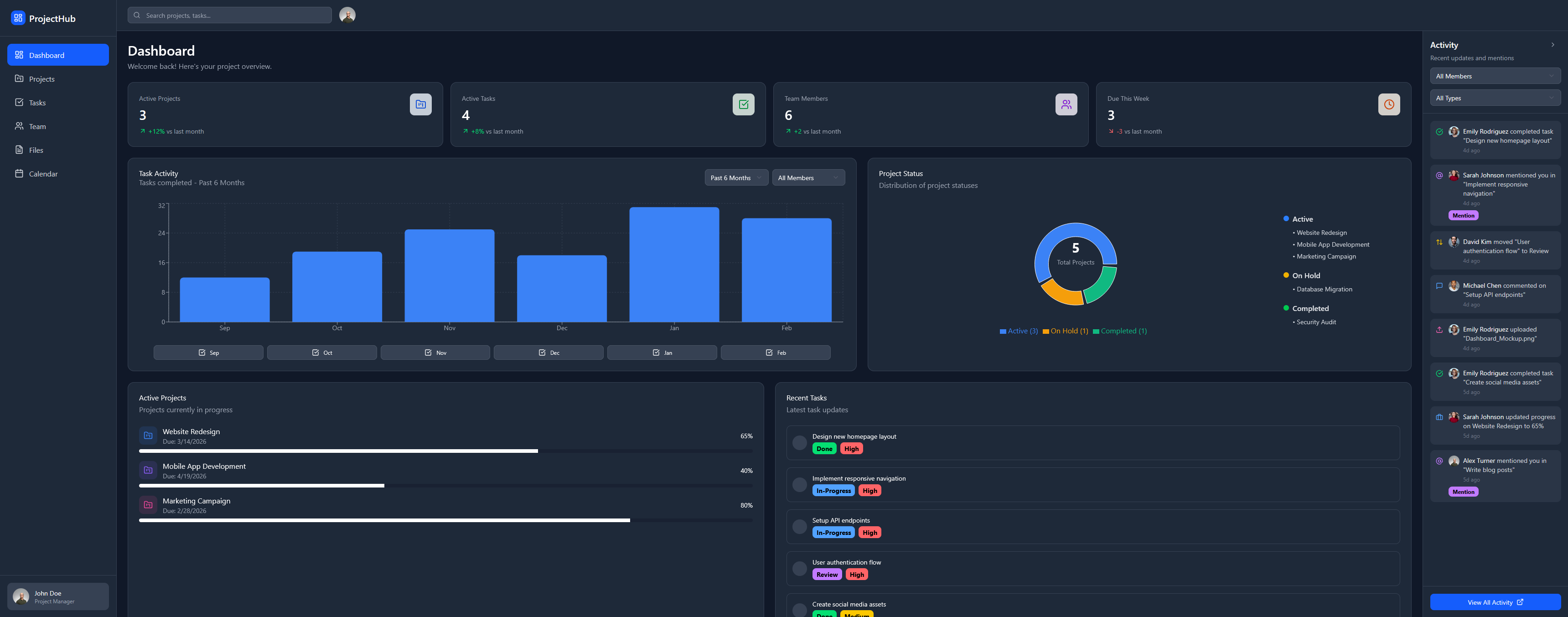
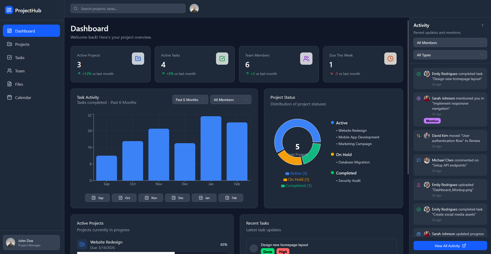
- Dashboard (high-level overview)
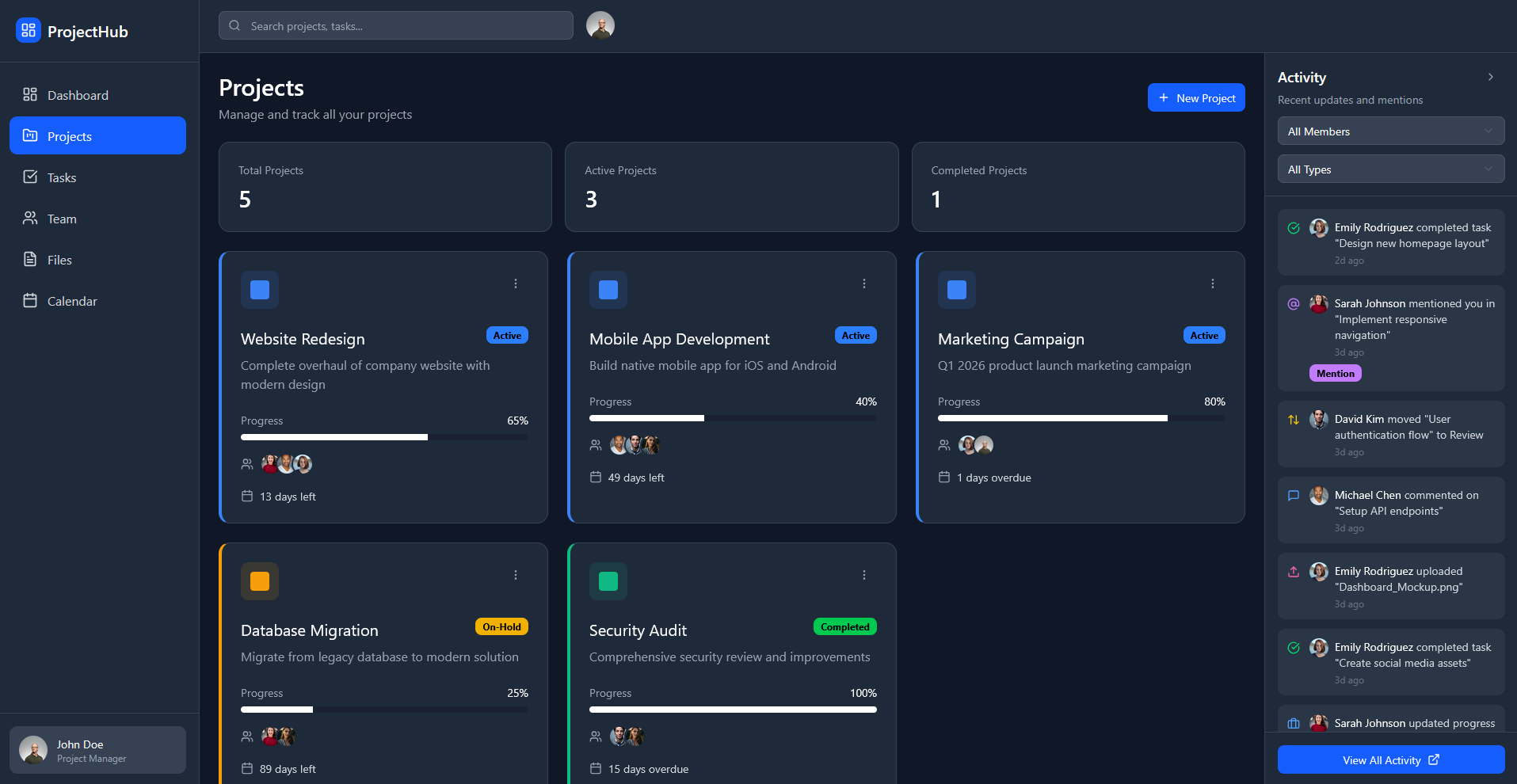
- Projects (progress + status)
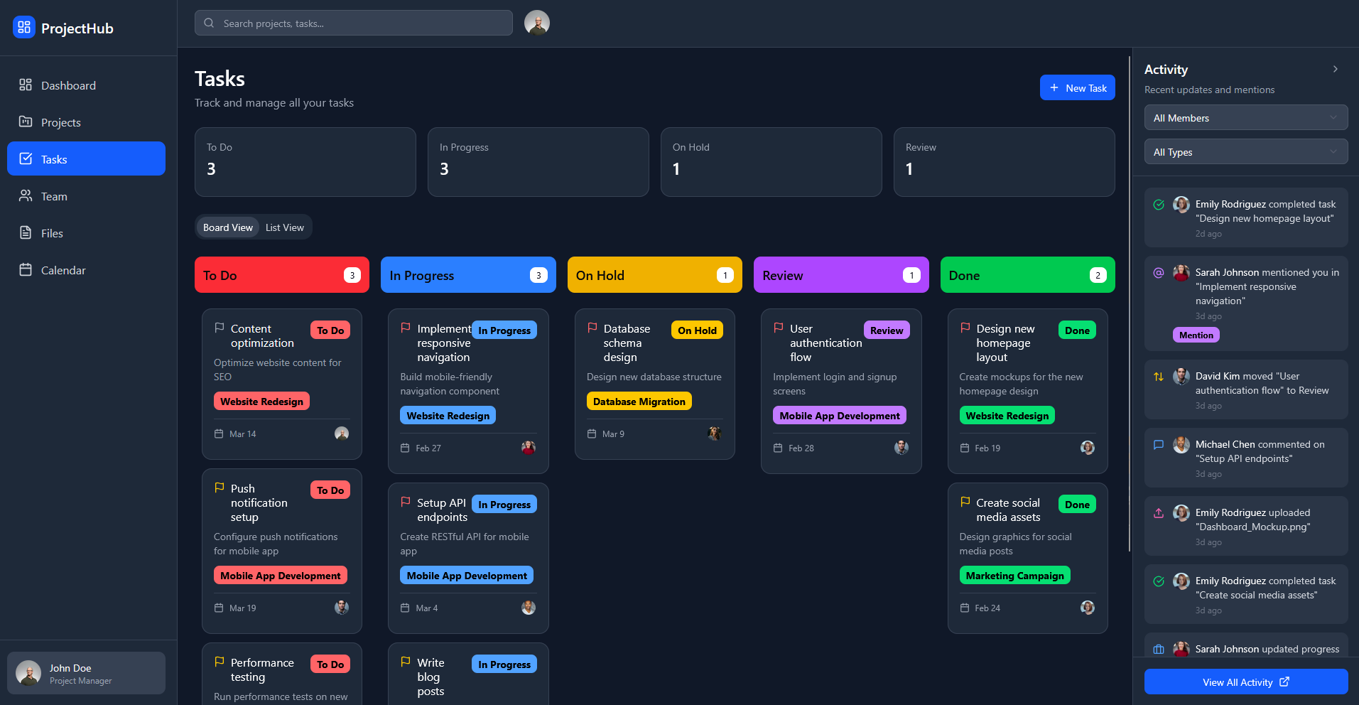
- Tasks (kanban workflow)
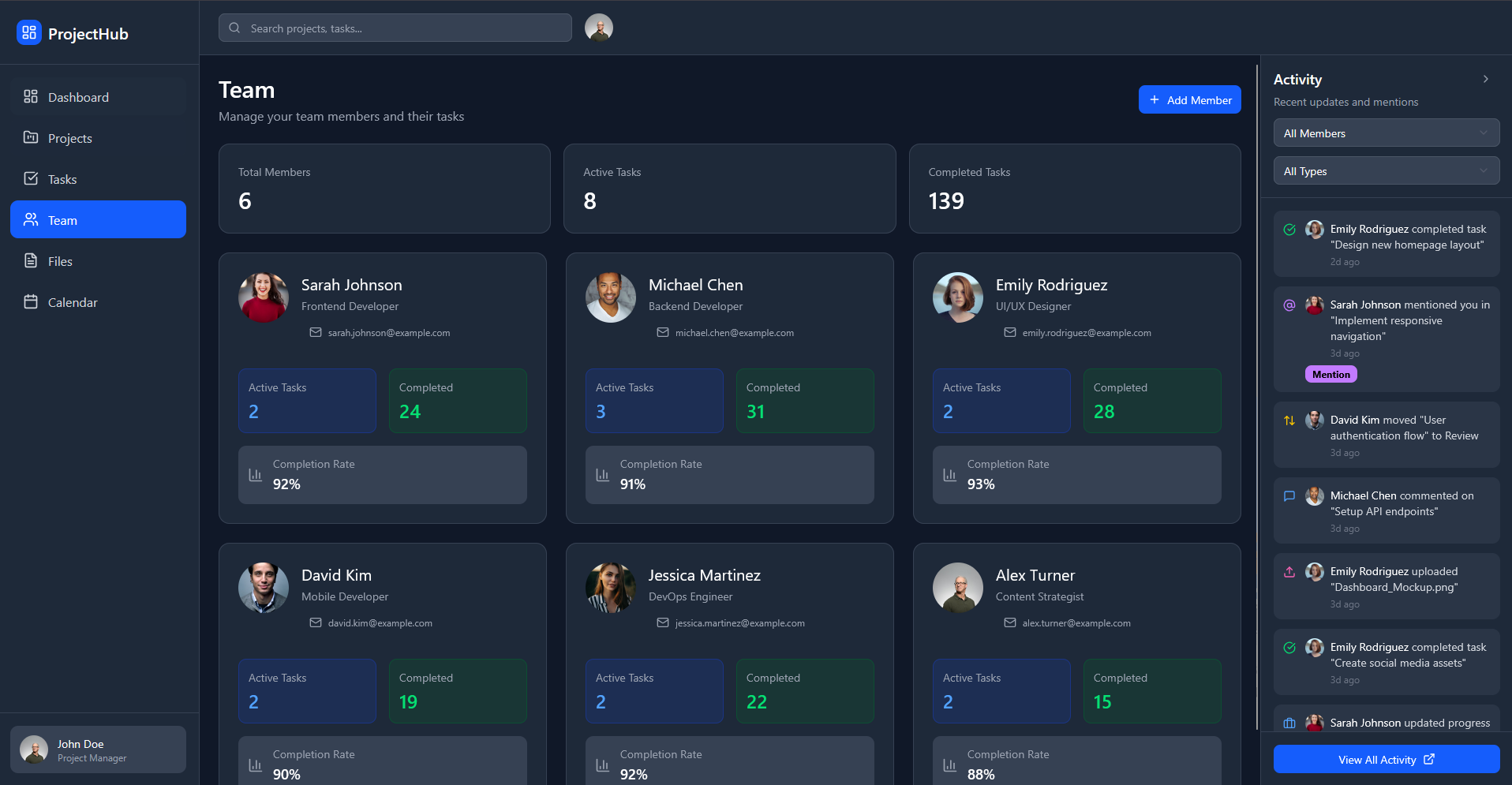
- Team (member performance & workload)
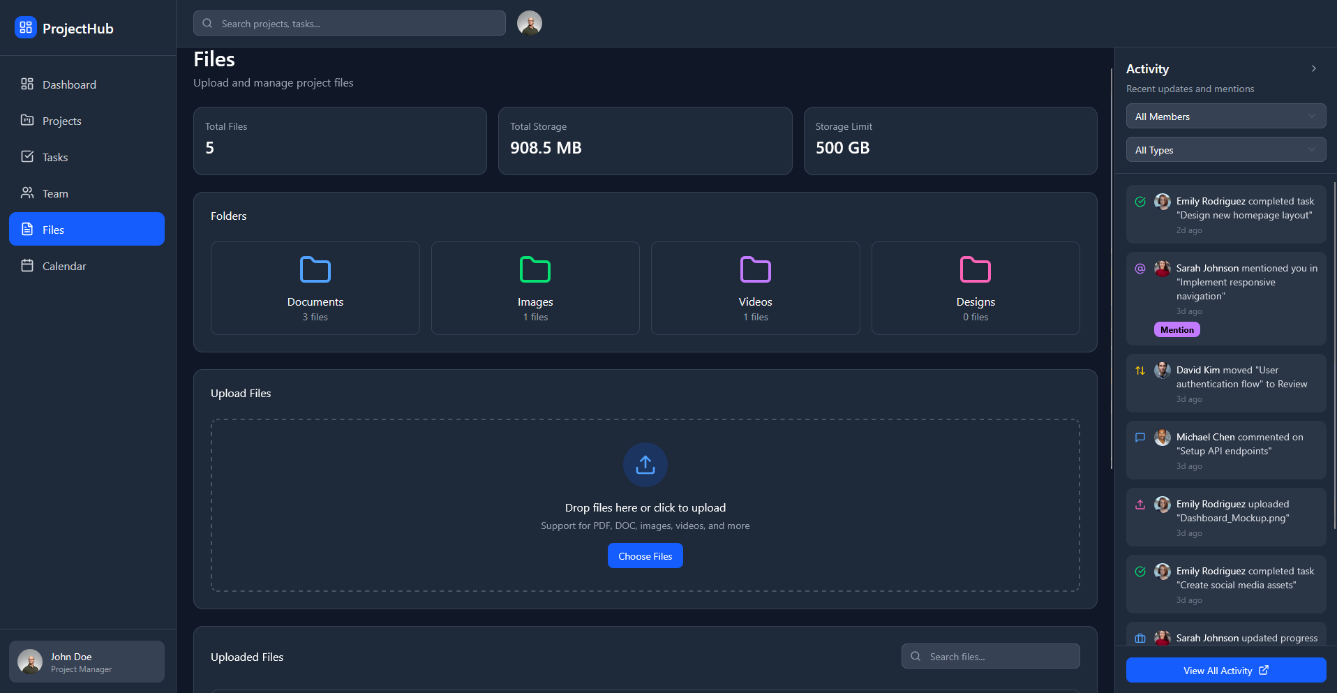
- Files (uploads & organization)
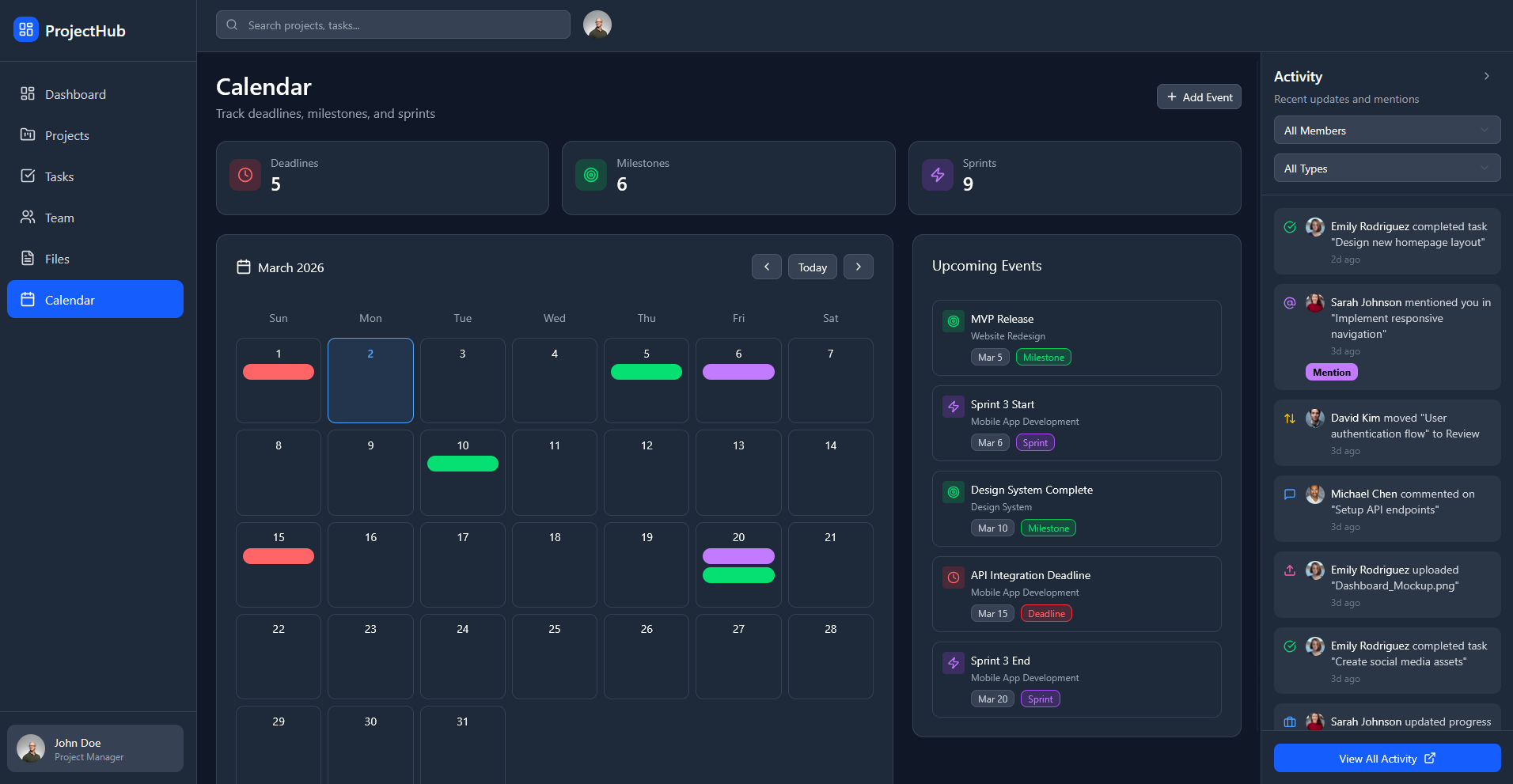
- Calendar (deadlines, sprints, milestones)
- Activity Feed (updates & mentions)
2. Layout System & Consistency I created a modular layout system using reusable cards and consistent spacing to keep dense information readable across all screens.
3. Iteration in Design Using Figma Make, I rapidly explored layout variations, refined hierarchy, and standardized components (cards, tags, progress bars, filters) to keep the system visually consistent.
4. Information Hierarchy Priority was placed on:
- Surfacing key metrics first
- Making status states visually distinct
- Keeping actions and filters predictable across views
The Solution
A multi-page project management dashboard that includes:
- Dashboard – High-level metrics and project status
- Projects – Progress cards with deadlines and states
- Tasks – Kanban-style workflow for task tracking
- Team – Individual workload and completion rates
- Files – Uploads, folders, and storage overview
- Calendar – Deadlines, milestones, and sprints
- Activity Feed – Mentions, updates, and changes
The system is designed to let users quickly move from overview → detail without losing context.

Key UX Decisions
- Card-based layout to support scanning and flexible reordering
- Status colors & labels to quickly distinguish states (active, on hold, complete, review)
- Consistent filtering patterns across pages
- Clear hierarchy between high-level metrics and detailed task data
The final design presents a cohesive, scalable UI system for project management workflows. It demonstrates my ability to
- Design complex dashboards with strong hierarchy
- Create consistent component systems
- Translate dense data into scannable UI
- Think in terms of product-level UX, not just single screens
What I’d Improve Next
- Add user testing to validate information hierarchy
- Explore customizable dashboards per user role
- Add personalization for filters and saved views